


Dallas-Fort Worth Metroplex
Go West Home Inspections
Preparing You for a Prosperous Future
Supporting you every step of the way to becoming a homeowner!
The knowledge that we impart will support you every step of the way as you draw closer to becoming a homeowner—just like the pioneers who went West to find a new place to call home.

Putting pen to paper to close on a home ushers in new beginnings for buyers and their families. At Go West Home Inspections, we stand with you during a potentially demanding time by providing an attentive and detail-oriented home inspection.
Broaden Your Knowledge With Our Detailed Reports
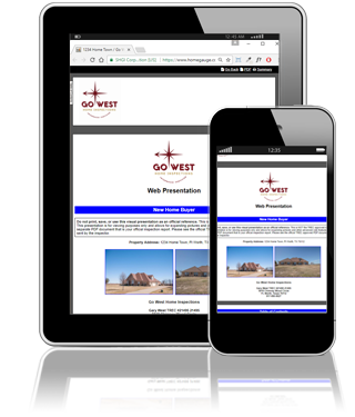
During your inspection, we’ll write up a comprehensive digital report that will be available within 24 hours. To help you fully understand your report, we supplement individual findings with pictures and video whenever needed to explain complex issues. We also provide access to the revolutionary Create Request List™ (CRL™) feature by HomeGauge. The CRL™ transforms your report into an interactive resource by allowing you to easily itemize pertinent findings. This customized repair and project request list can also be used by your real estate agent and passed on to the seller.
Serving the Dallas-Fort Worth Metroplex
Go West Home Inspections offers professional home inspection services to the greater Dallas-Fort Worth metropolitan area.
At Go West Home Inspections, we work for you—and with you—to help you reach your goal. Contact us today to schedule an appointment.


Ask About Our Discount
As a token of our appreciation for your valiant service to our country, we offer a $25 discount to active military personnel and veterans. The same discount is available for first-time homebuyers and seniors.


InterNACHI MEMBER #15041324
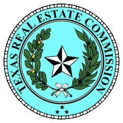
TREC LICENSE #21495
<center><script type='text/javascript' src='https://www.rapidscansecure.com/siteseal/siteseal.js?code=145,A9226652C0A3D004A85DD01E8509CEB9DC617ABB'></script> </center>